Touchstone
We helped nationwide property management firm Touchstone sharpen commercial advantage and enhance its reputation by reimagining its purpose, values and brand.
Touchstone already had excellent reputation for practical property management. Less recognised, however, was Touchstone’s human understanding of tenants and landlords. After 25 years in business, Touchstone’s employees get what it takes to make a rental property truly feel like a home. In 2015, Touchstone asked us to capture this intelligence and turn it into a competitive edge.
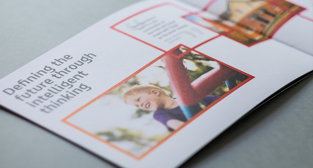
Working closely with Touchstone’s senior leadership team, we redefined Touchstone’s purpose as “Pride of place: turning rental units into homes”. This has energised Touchstone’s business strategy and formed the basis for full rebrand.
Touchstone’s refreshed purpose delivers a clear commercial advantage. When tenants feel truly at home, they stay longer and value and look after the property. This reduces turnover, maintenance and management costs for landlords.
As Tim Saunders, Chief Executive of Touchstone, says: “We want to create a world where landlords and tenants recognise and respect each other’s needs. The more we can create a genuine sense of home for tenants, the lower the costs and the greater the profit.”
This in turn helps to create better neighbourhoods and communities, as tenants who stay longer tend to create more long-lasting connections and become part of the social fabric.
This clear purpose can now be felt across every part of Touchstone’s business strategy, culture and brand.
The firm now invests more in developing proprietary property intelligence based tenant surveys and market research, which allows it to provide advice and insight to institutional investors before homes are built. Recognising that lifestyle factors affect property yield in increasingly sophisticated ways, Touchstone can advise on the best deployment of amenities and use of communal space.
To help build better neighbourhoods, Touchstone’s tenant guides now include information on local schools, groups and amenities.
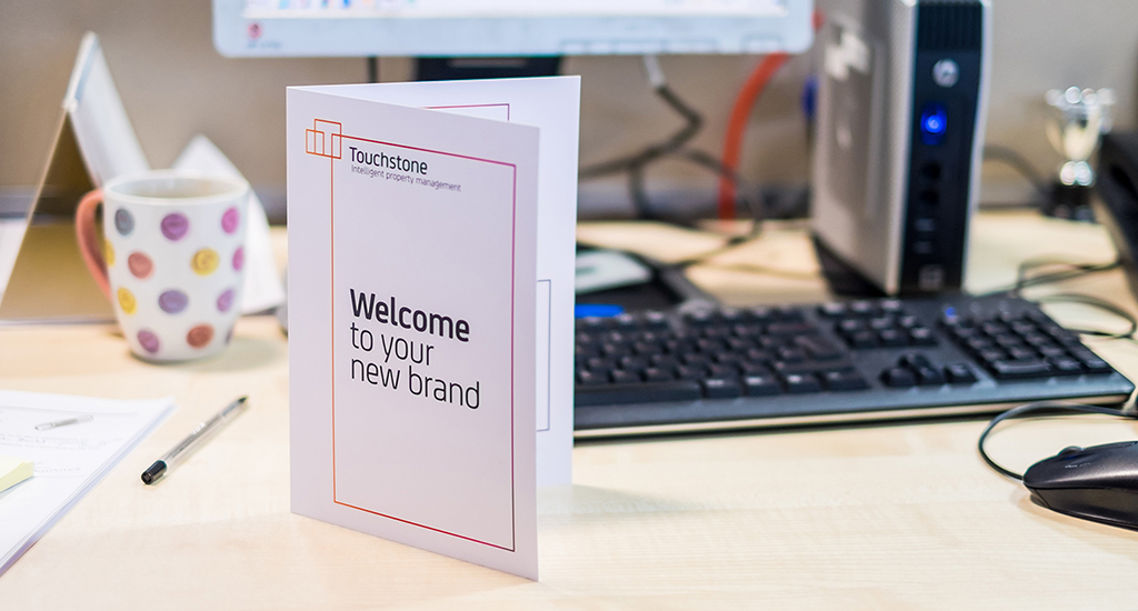
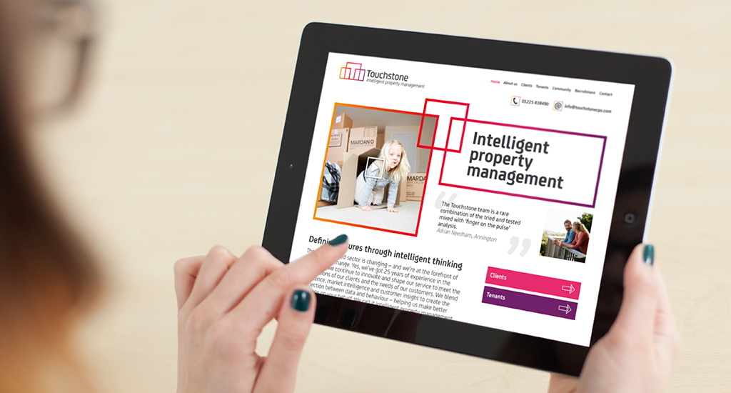
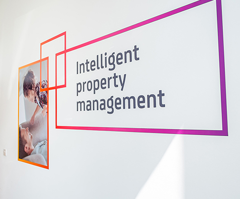
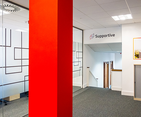
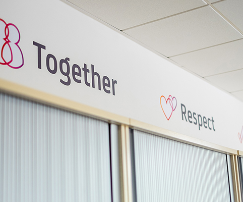
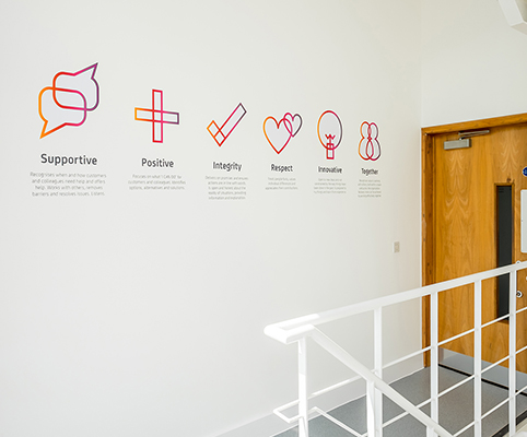
We’ve helped Touchstone communicate its new purpose by creating a visual identity that expresses how the firm uses intelligent property management to match the right tenants to the right homes. In it, the “T” of Touchstone overlaps the landlord and tenant, making up a “total view” of a home.
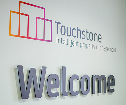
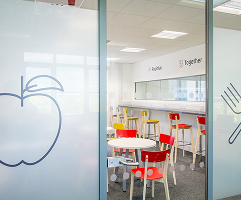
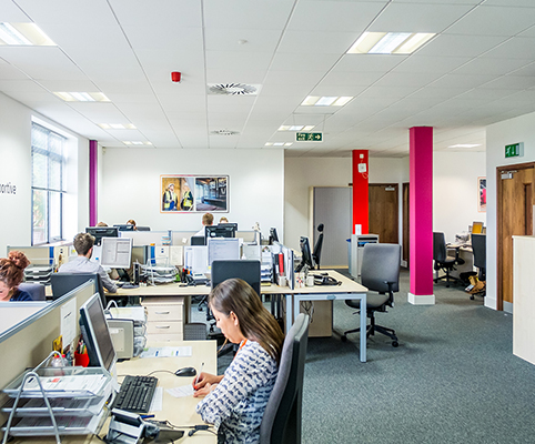
The identity uses bright and warm colours, a progression from the more austere and traditional look of its previous identity. The visual identity has been rolled out across all of Touchstone’s operations, from office design to marketing materials.